Bank of Canada: Head Office Renewal
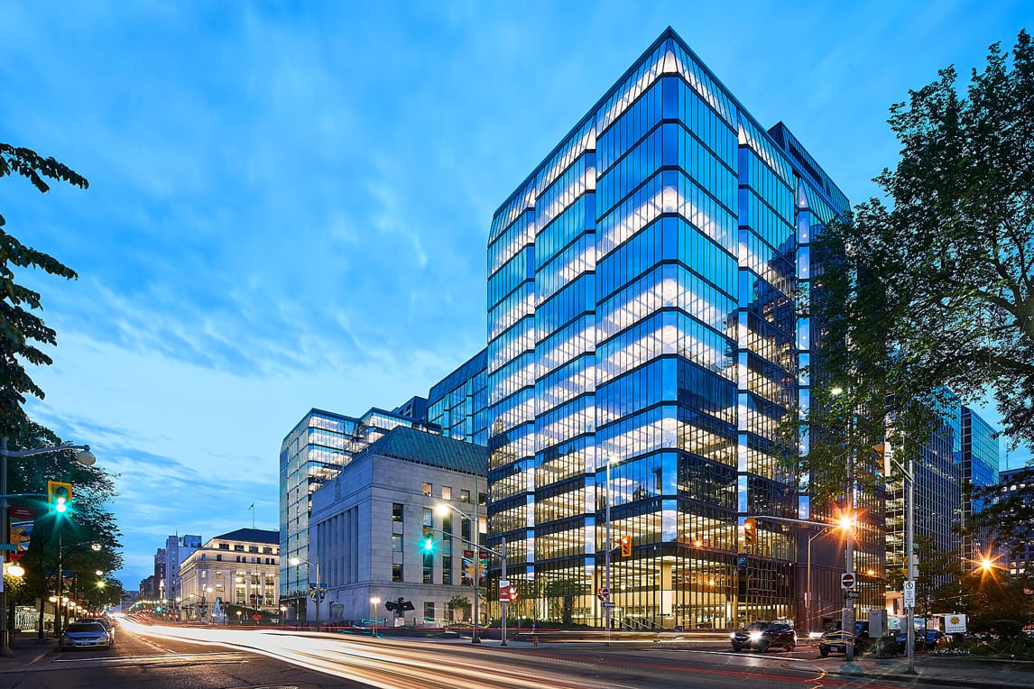
The team at GMLD were entrusted with bringing the lighting of the office areas of Arthur Erickson’s iconic Bank of Canada addition into the modern age.
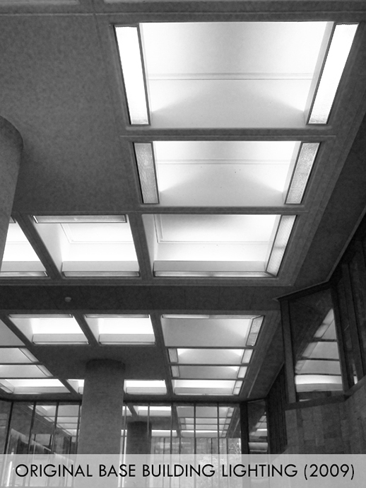
How best to efficiently and comfortably illuminate the typical office floorplate below Erickson’s signature concrete waffle ceilings? The lighting design at the time of renovation used two perimeter rings of indirect fluorescent uplighting, an inner and an outer square. To find the best solution for the renewal, GMLD undertook extensive studies and performed many mockups with the client and architects.
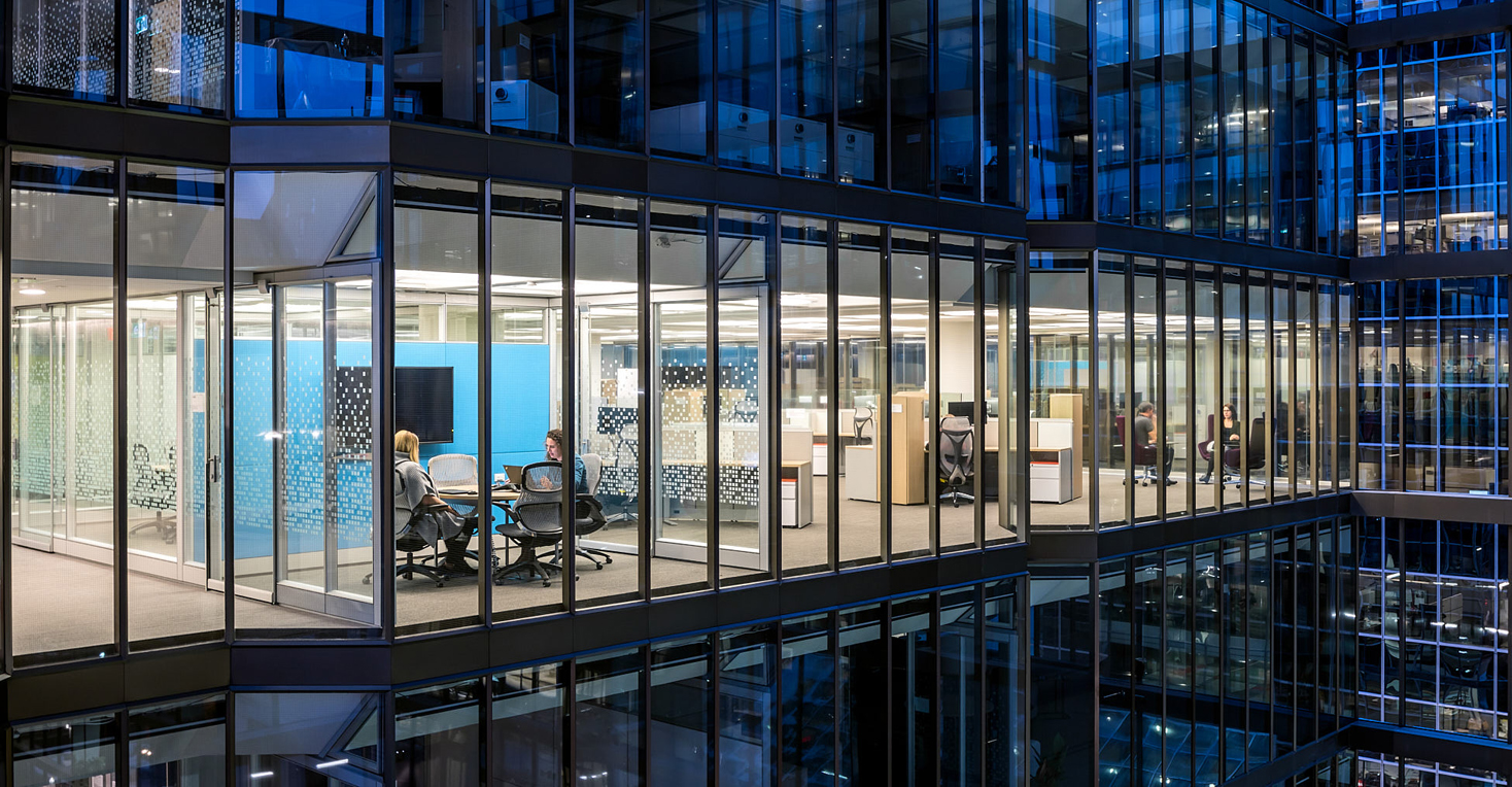
A direct LED replacement of the original design was studied, and it was found via mockup that the fixtures were better replaced with a single square ring of direct-indirect LED. The new solution used less energy, and made the spaces feel more modern, comfortable and airy. It also made the coffers appear more symmetrical and emphasized the extra height the design team were able to provide, with much of the HVAC being moved to the perimeter in the renewal.
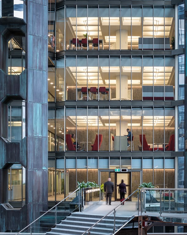
Another important aspect of the lighting design was the strong wash of light onto the vertical cores of the building, for example near the elevators. The strong wall wash emphasizes the texture of the stone walls, and the multiple floors become cohesive when viewed from a distance.
The result – a completely refreshed office space that responds to the way people work today, emphasizing connection and providing the bright and welcoming workspace that is expected by today’s top talent.
(Note – GMLD scope did not include landscape, new museum or atrium common areas. These areas were completed by other team members.)
Please get in touch with us at GMLD if you need professional advice on illuminating your workplace, or on any other lighting challenge!
PRESS:
The project was featured in the December 2018 issue of Canadian Architect.
May 2018 Azure Magazine
Project Details
PROJECT TITLE: Bank of Canada: Head Office Renewal
PROJECT TEAM: Perkins & Will, DTAH, Evoq Architecture
PHOTOGRAPHY: Doublespace
COMPLETION 2017
LOCATION: Ottawa, Ontario | Canada
BUDGET $129.9 M
SIZE: 77,574 square meters (835,000 sf)
CERTIFICATIONS: LEED Gold (Certified July 2019)
AWARDS:
Ottawa Urban Design Award, Award of Excellence – Public Places and Civic Spaces, 2017
Existing Building Upgrade Award – Canadian Green Building Awards, SAB Magazine, 2019
Award of Excellence – Canadian Consulting Engineering Awards, 2018
Honorable Mention, Workplace, Innovation by Design – Fast Company, 2018
View more projects in Office/Commercial


